cd release concert
by jenn on 2012 july 15
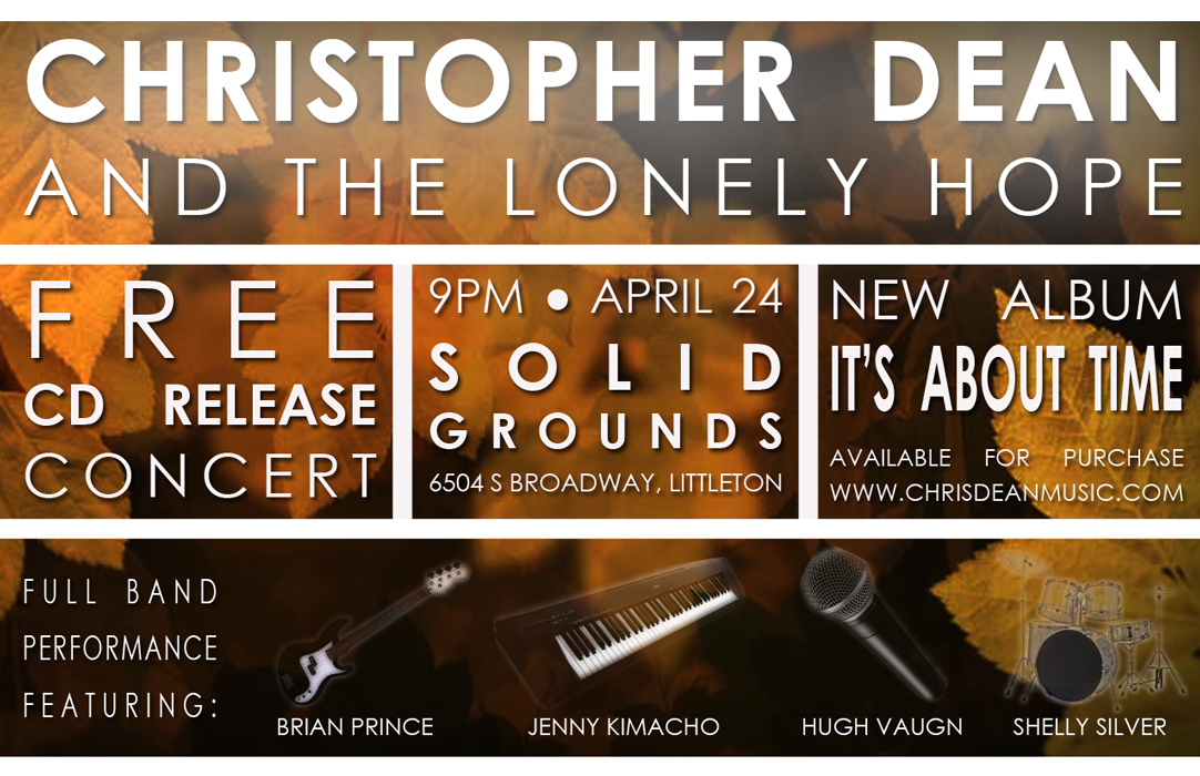 I had a great opportunity to create a flier for a local recording artist! My friend plays in his band and they just released a new cd - very cool stuff! So I made this flier to promote the event, which was a fairly small thing at a local coffee shop - which has surprisingly excellent coffee and an amazing atmosphere, by the way.
This is probably my best and most sophisticated Photoshop work yet. I'm excited with my progress! The images of the instruments were definitely a challenge - especially when down-sizing the thing to create the thumbnail image, for some reason. But I'm thrilled with how it turned out and everyone seems to have nothing but positive feedback. Success!
fractal art
by jenn on 2012 june 06
 Today, the thought popped into my head that it would be really cool to learn to make fractal art. So I sat down at my computer and did it! It's amazing all the exciting stuff you can get done when you don't have a day job bogging you down. May summer vacation never end!
So I downloaded a fractal generator called Tierazon and started playing around with it. It is so cool! I can't wait to make more art! I'm not very good at controlling all the different variables yet, but I think that will come with practice. This is image is the very first fractal I created. I'll post some more once I truly master it!
magazine covers
by jenn on 2012 february 07
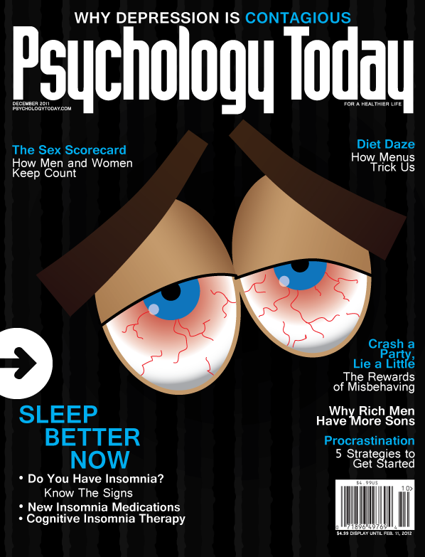
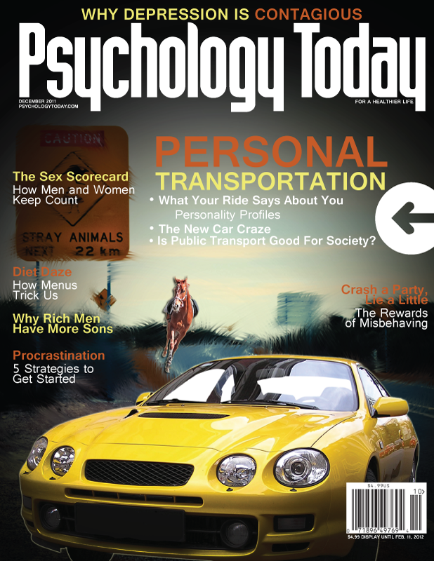
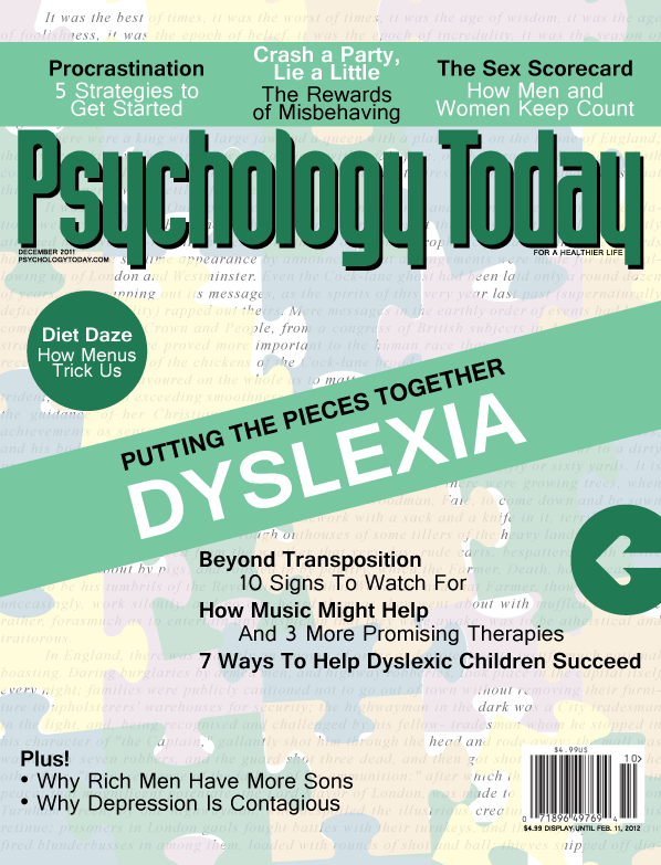 This was an assignment from my Illustrator class last semester. It was actually really cool and conceptual. We had to pick a psychological disorder, research it, and then come up with a way to represent the disorder using only illustration (no photos) as a fake cover for Psychology Today.
I picked insomnia and dyslexia. Conceptually, I think the insomnia one is a bit too literal, since it's basically a cartoon of a tired person. But I did create the whole thing using only vectors, so I suppose it counts. The one about dyslexia I like much better, but it didn't turn out quite the way I wanted it to. My original concept was to have the book's text actually on the puzzle pieces, instead of the pieces being on top of the text. But I couldn't come up with an elegant way to do that with my limited technical knowledge at this point, so I did something a little easier instead. I think it still gets the message across.
easter sunday poster
by jenn on 2011 december 08
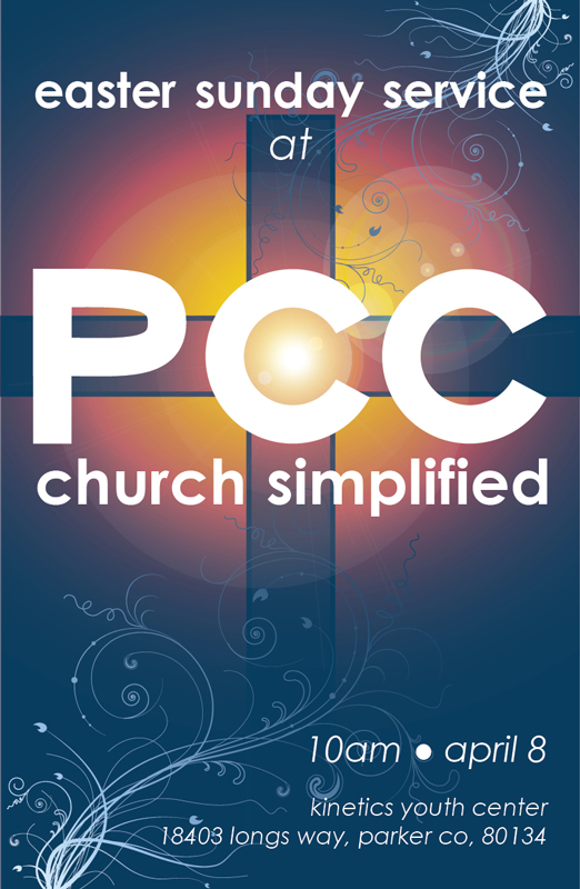 Here's a fun one for a real client! A poster advertizing the Easter Sunday Service for Parker Community Church in Parker, CO. They're also requesting a branding overhaul, which will be a fun challenge. I'll post some more when I finally get around to mocking up some logos. It's such a long name for an organization that I haven't come up with very many good ideas yet. We've also considered just working with "PCC", since there seems to be a naming conflict with another church in the area. More once I meet with the senior pastor for a brainstorming session.
summer photoshop work
by jenn on 2012 june 21
 I'm so fortunate to be taking two classes using Photoshop this summer! It's turning into a really rich learning experience. Learning to paint in Photoshop is definitely tough. It's pretty much as hard as learning to paint with a brush! Very exciting things on the horizon, for sure.
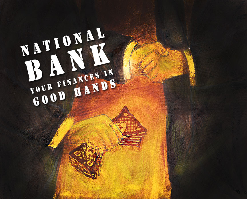 Here are some of my recent Photoshop creations. Just basic fake promotional materials for my classes, of course. But I had a lot of fun making them and improving on the assignments' aesthetics. Too often these things ask for too little, so I usually feel compelled to do much more for the simple need to do them right.
another fun informational website
by jenn on 2012 march 13
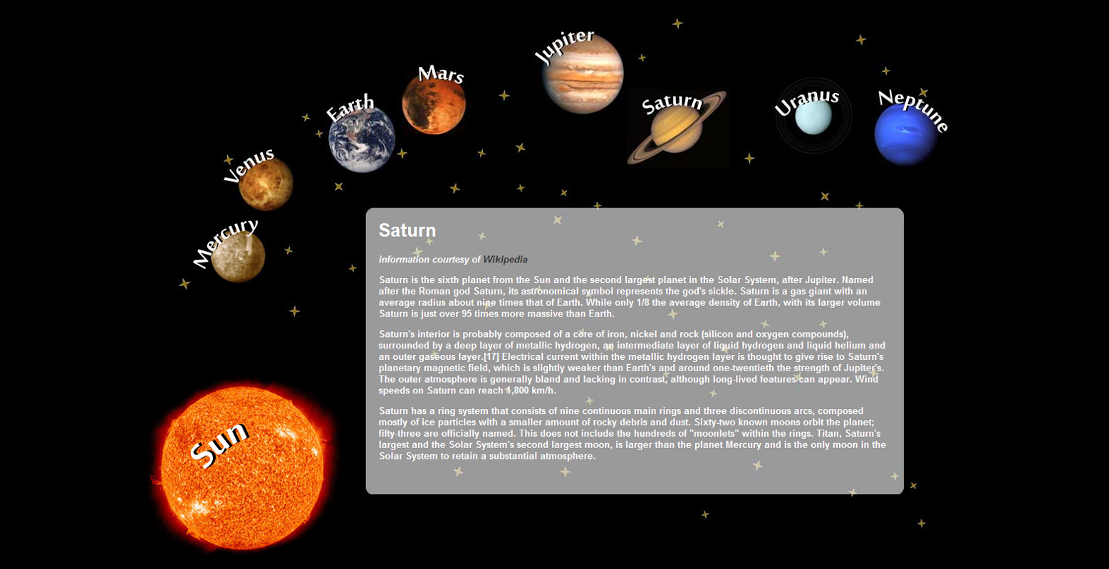 This one was another fun web design assignment. We had to create a composite image in Photoshop, then slice it up and use it to create a website. Fun technique, but kind of limiting because it only works with fixed-width layouts. I definitely enjoyed throwing the traditional box layout completely out the window and making something more free form. I also got to experiment with new overflow features and mouse-overs.
informational website
by jenn on 2012 february 02
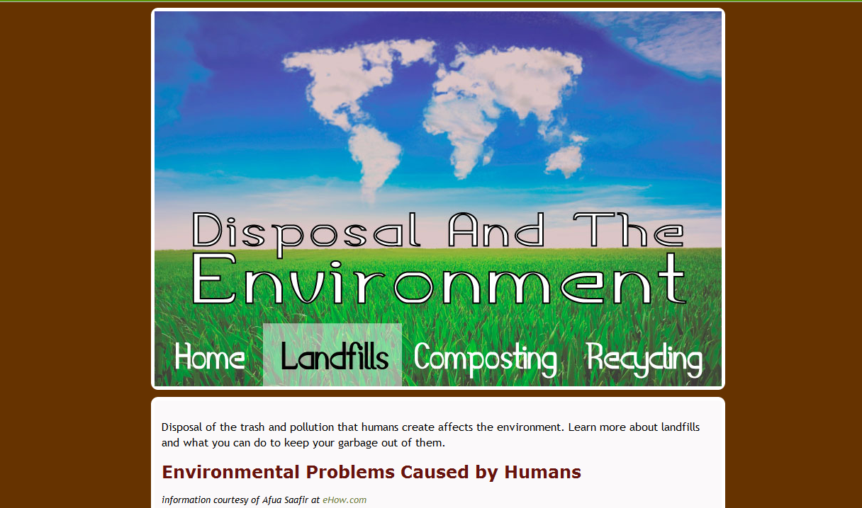 This was an assignment for my web design class, which I am loving by the way! I think I would be completely happy with my life I could just do web design and nothing else for the rest of eternity. But any ways, we had to create an informational website using image navs in a creative way. So I found a neat image online, sliced it up using Photoshop, and created some nice rollover effects. Overall, I'm pretty pleased with the results. I hope I get a client in the future whose website would work well with this technique!
halloween poster
by jenn on 2011 november 27
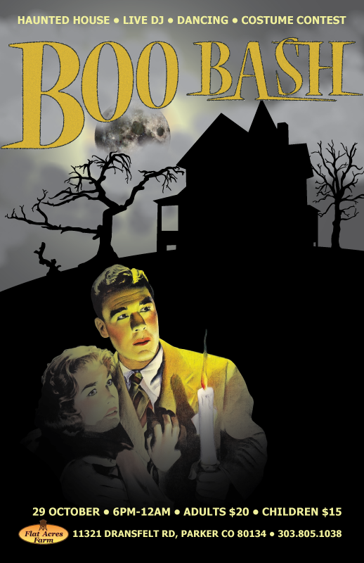 Fall 2011 has been my first semester with some formal graphic design training. Illustrator has been so hard, but I think I'm getting the hang of it. Here's one of my first Illustrator projects that I think turned out somewhat well: a halloween poster for a made up event.
I've gotten a lot of mixed feedback on this one. Some people really do not like the mix of styles, and I get that. I was trying to creatively mix different media in one poster without making an effort to blend them together, each one standing on its own. Perhaps I'll consider overhauling it once I get better at Photoshop